
Context
We Are What We Eat reimagines how individuals and families engage with information on nutrition. Originally focused on anorexia nervosa, this project is not a replacement for professional medical care.
I joined the project mid-way, contributing from content development through to visual design and implementation within Shorthand.
ROLE
–
Content Designer
Information Designer
TEAM
–
Kimberly Blacutt
Malavika Ketan Doshi
Revati Naniwadekar
Sage Rohrbach
Stacie Rohrbach
DURATION
–
2025
TOOLS
–
Adobe Creative Cloud
Figma
Miro
Shorthand
Problem Space
Information about anorexia nervosa is either buried in dense academic research or oversimplified online
This confusing landscape prevents families from recognizing the illness early, delaying critical medical care.

We asked:
How might we make information about anorexia nervosa easier to understand and less intimidating?
Solution
Explaining the biological impacts of malnutrition through scrollytelling
We organized complex biology into simple, body-system segments. This approach utilizes narrative, color, and scroll motion to make the information less intimidating.


We Are What We Eat lives within Shorthand, creating a responsive, easy-to-read experience across phones and tablets.

Subtle reveal animations bring visuals to life, helping users visualize changes.

Background and body color changes suggest changes in emotional or physiological states.

Users can explore the effects of malnutrition across different body systems, providing a holistic understanding of its impact.
Research & Content Design
Introducing content restructure based on the human body systems
Before I joined, the team mapped extensive neuroscience, biology, and psychology data into a topical script. I introduced the strategy to restructure the script around human body systems, such as the digestive, endocrine, and cardiovascular.

The team organized content into a script divided into sections such as Introduction to Anorexia Nervosa, Biological Onset, and Biological Impacts.



By grouping the information into thematic buckets, we made the content more approachable.


I translated complex scientific concepts into clear, accessible language.
Scope Change
Pivoting the project's scope based on user testing and feedback
We tested the script with participants of varying ages and levels of scientific literacy.
Based on these insights, we built a modular prototype for malnutrition that sits within a larger resource library on anorexia nervosa, allowing users to explore topics in focused segments.
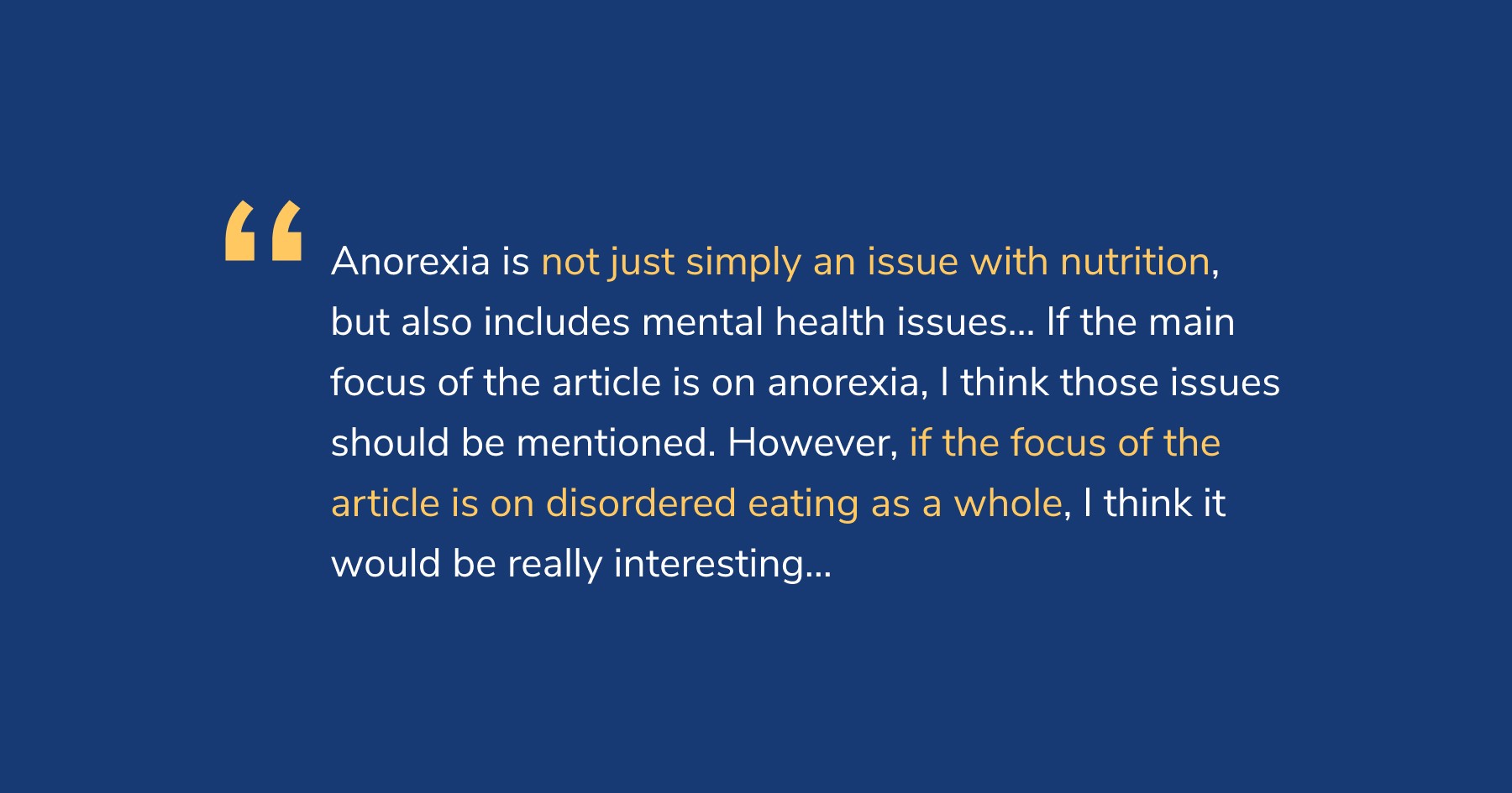
I interviewed a public health professional whose insights led me to question if we had properly defined our scope.
Development
Designing around and within Shorthand’s software limits
Building the digital experience inside Shorthand brought distinct technical limits. Motion was restricted to basic reveal effects. We had to ensure the entire layout remained responsive across all devices.


Responsive layout boundaries required careful attention to grids, element placement, and text hierarchy to guarantee total consistency across mobile, tablet, and desktop screens.