
Context
The Birth Story explores how parents can capture the details and emotions of childbirth in real time.
The Birth Story is a Carnegie Mellon University design project created as a micro-app concept for Myana, a postpartum support platform by Dezudio.
With Eindra Lin, I contributed to wireframing, prototyping, and user testing. While we received client feedback, the work was not done professionally with Dezudio.
ROLE
–
Interaction Designer,
Mobile UI/UX
TEAM
–
Eindra Lin
DURATION
–
2025
TOOLS
–
Adobe Creative Cloud
Figma
Problem Space
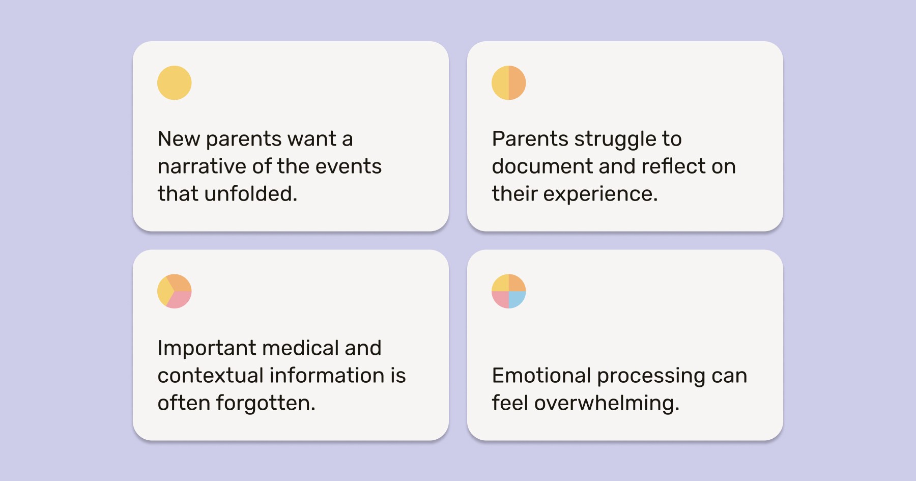
Our client's research showed that new parents often struggle to remember and share their birth experience
Intense emotion and medical urgency make it difficult for parents to capture details in real time, resulting in key memories and context becoming lost.
We asked:
How might we support both memory and reflection without overwhelming new parents in the moment?
Solution
Emotionally sensitive experience that allows new parents to capture their birth story on their own terms
Our final concept makes documenting birth stories simpler and more personal, offering an easy-to-follow timeline alongside an at-a-glance overview.

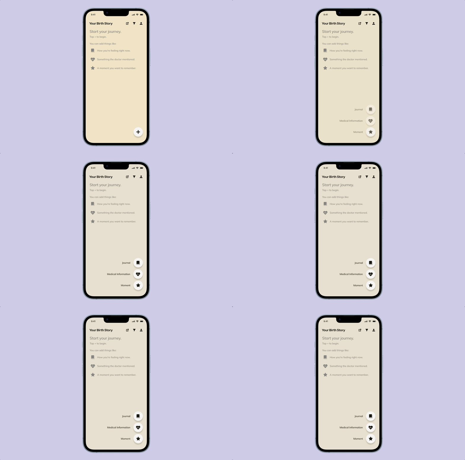
Timeline: Parents can add journal entries, medical information, and moments to a chronological timeline.
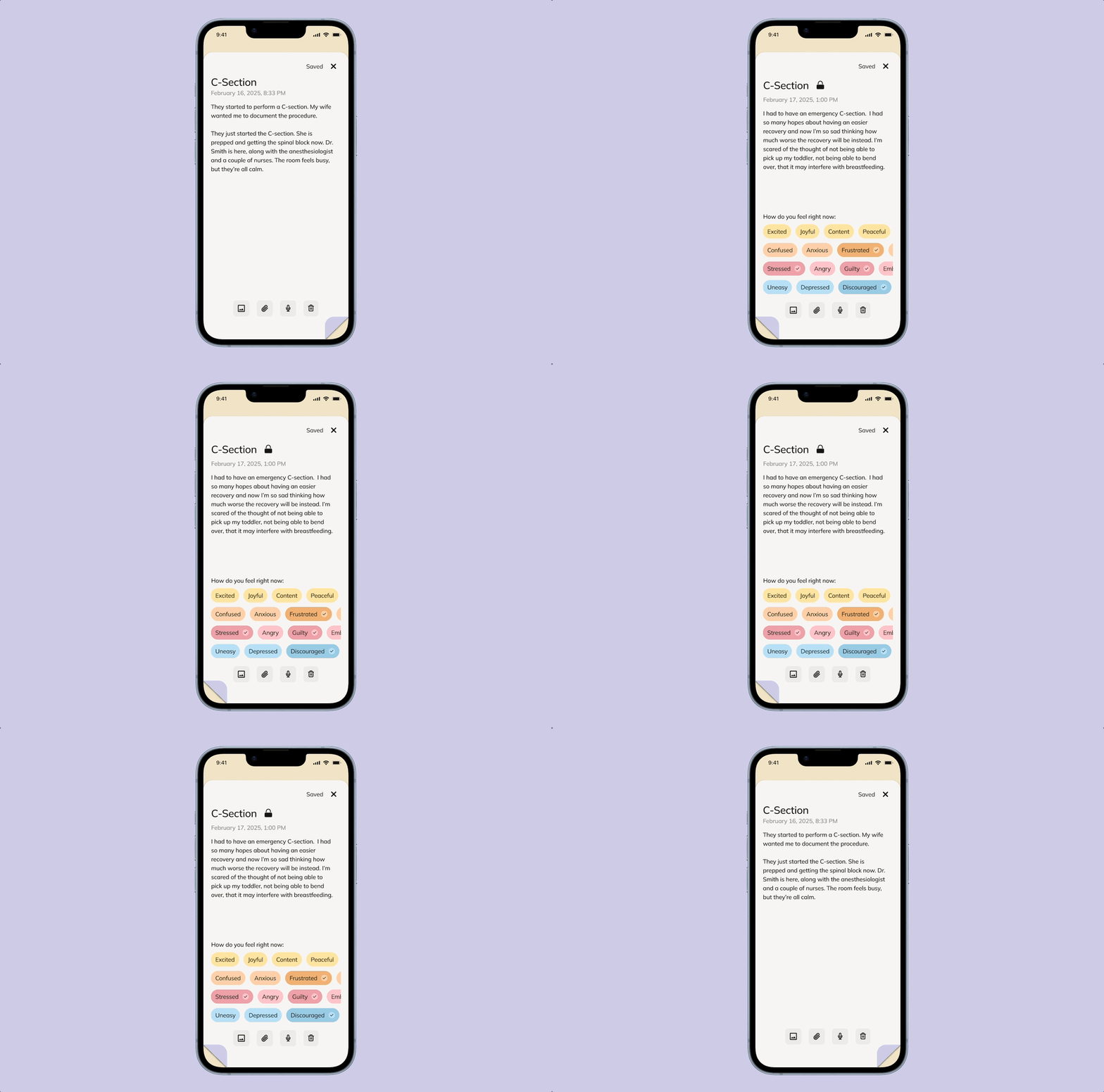
Card-Based Journal: Card format that allows parents to jot down reflections immediately or flip cards to write later.
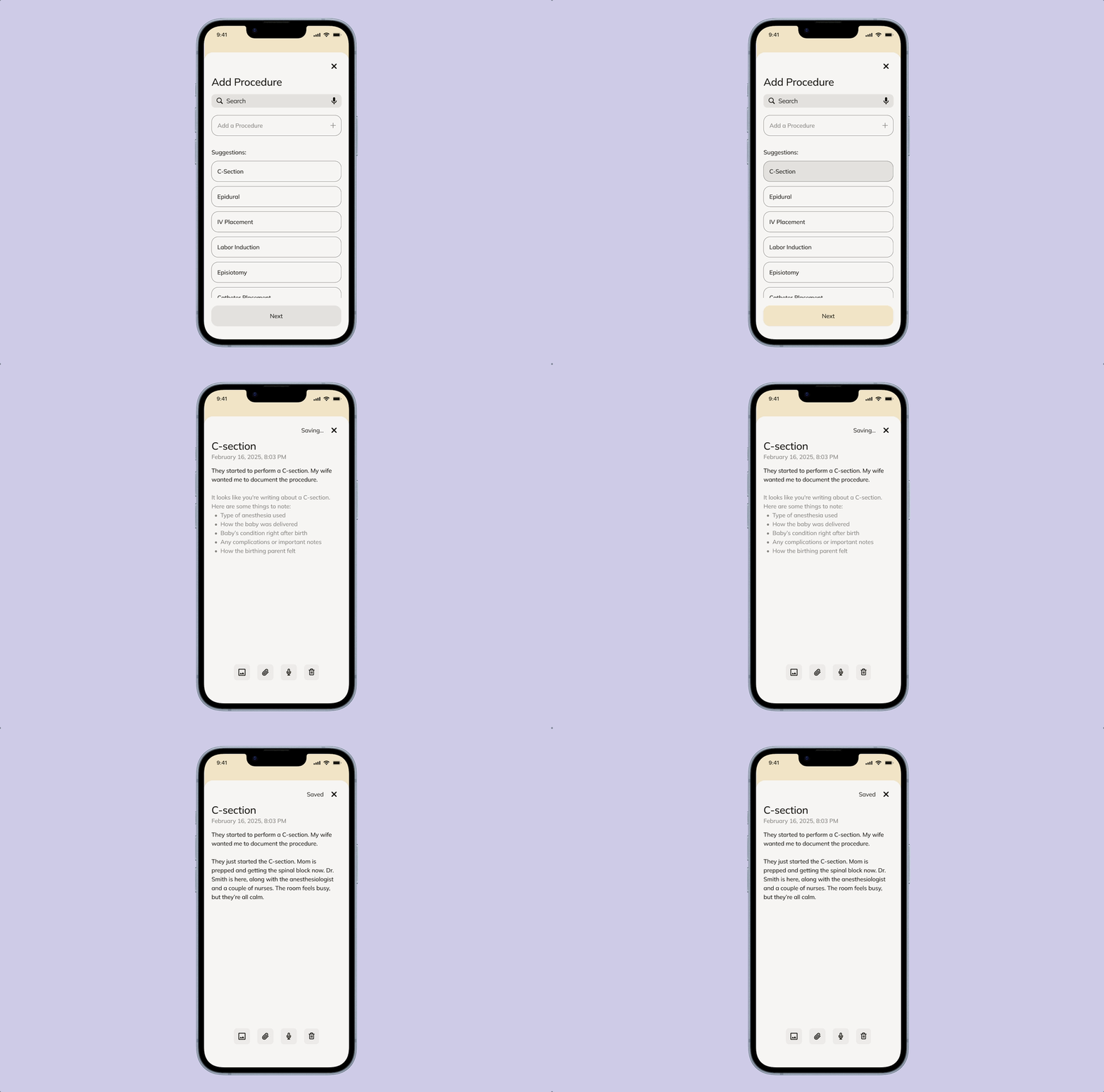
Medical Information: Structured list for clinical details, enhanced with smart suggestions based on user entries.
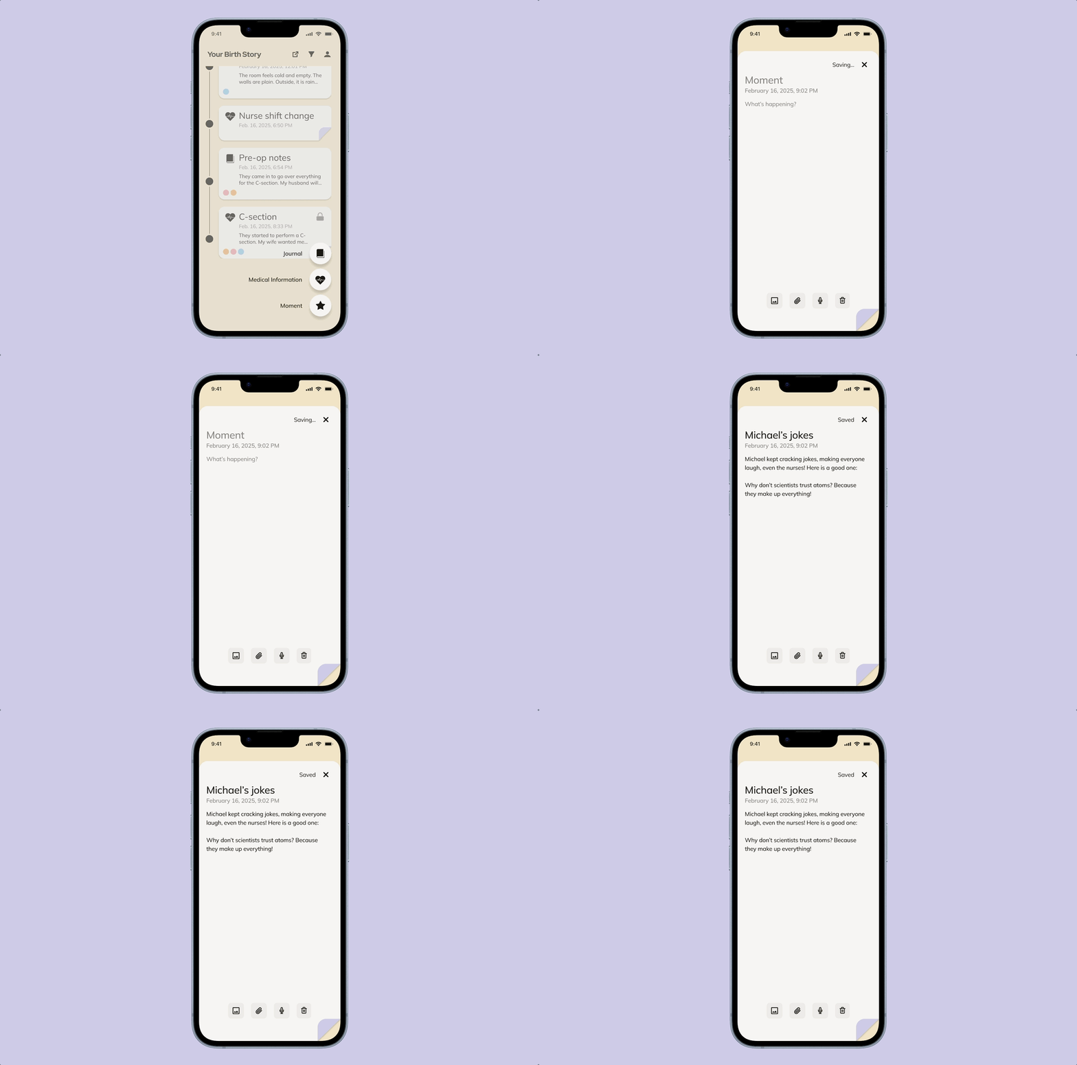
Moments: Quick captures for photos, thoughts, or milestones.

View Your Birth Story: Entries are visualized as circles, representing the journey in one glance.
RESEARCH & Content Design
Centering the app on clarity, emotional resonance, and ease of documentation
To start, we dove deep into existing industry standards, market analysis, and user behavior.
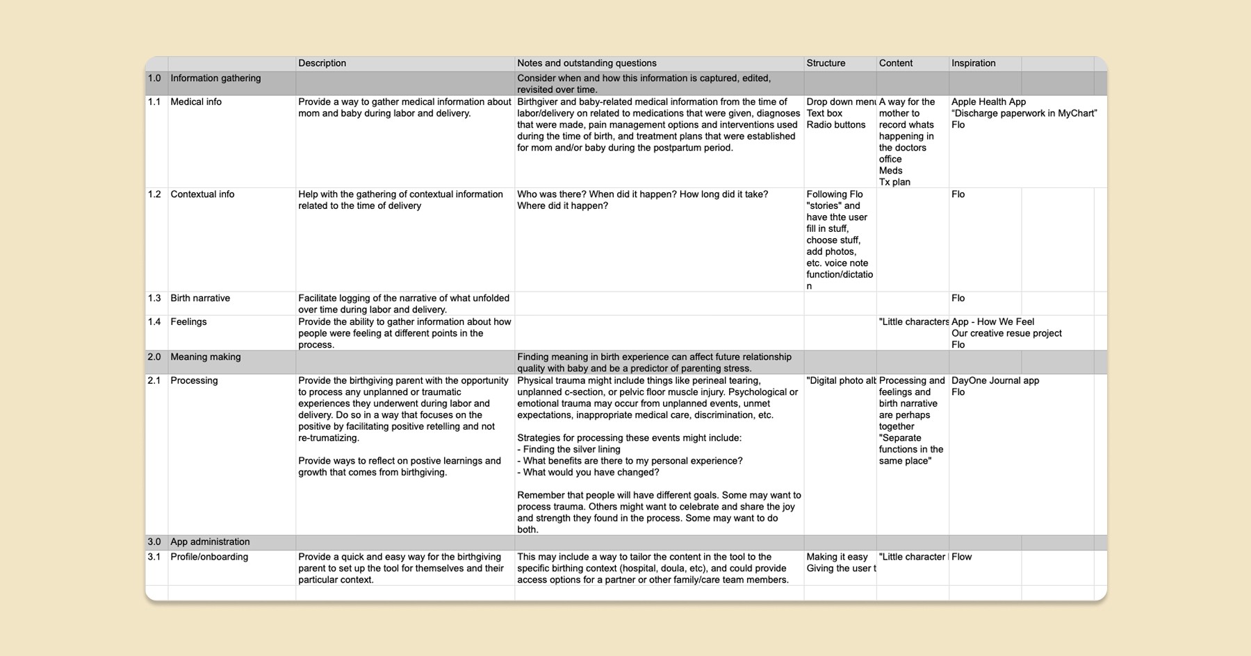
We conducted a competitive analysis of health, self-care, and journaling apps, then reviewed client research to surface key insights.
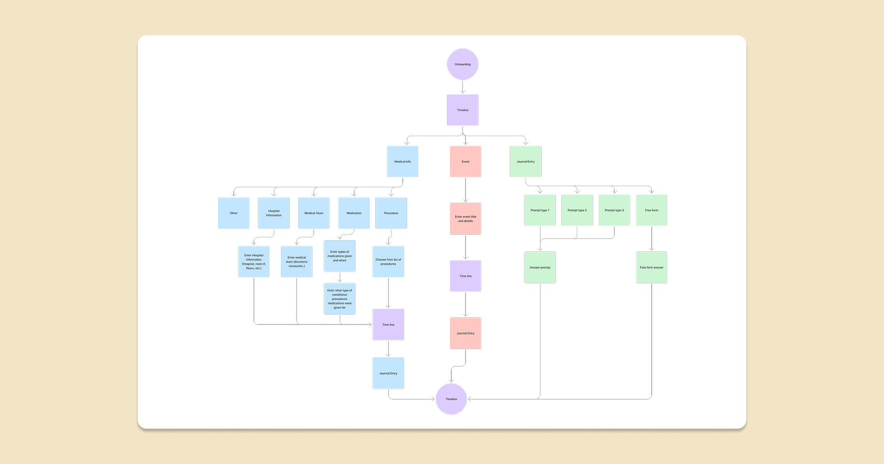
We organized the app around three core needs, with an information architecture supporting event tracking, reflection, and logging medical details.
Evaluative Research
Testing revealed that even well-intentioned features can overwhelm users in moments of vulnerability
Feedback from two new mothers revealed that the experience felt too demanding during labor, highlighting the need for a simpler, more intuitive, and motivating design.
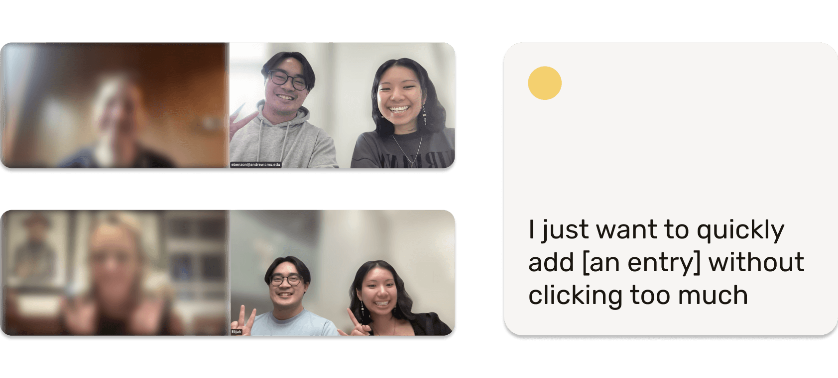
User testing guided our next iterations toward reducing cognitive load and streamlining interactions for real-world use.
Key Iterations
Refining to better support emotional expression, simplify documentation, and motivate consistent use
Based on feedback, we made three main iterations:
Freeform Journal
Emotion Colors
Motivating Features
1. Freeform Journal
We condensed the journal into a more freeform format, making reflection faster and less structured during intense moments. Instead of structured prompts, the journal allows open-ended reflection.

2. Emotion Colors
We introduced a color system for emotions, giving the app a cohesive visual language and helping users quickly express feelings. Our color palette is based on the colors we used with the emotions found in the journal.

3. Motivating Features
Added motivating features to encourage consistent use, such as a visual “full story” in circles to track completed entries. Using our color circles from our timeline, we created the Birth Story.
